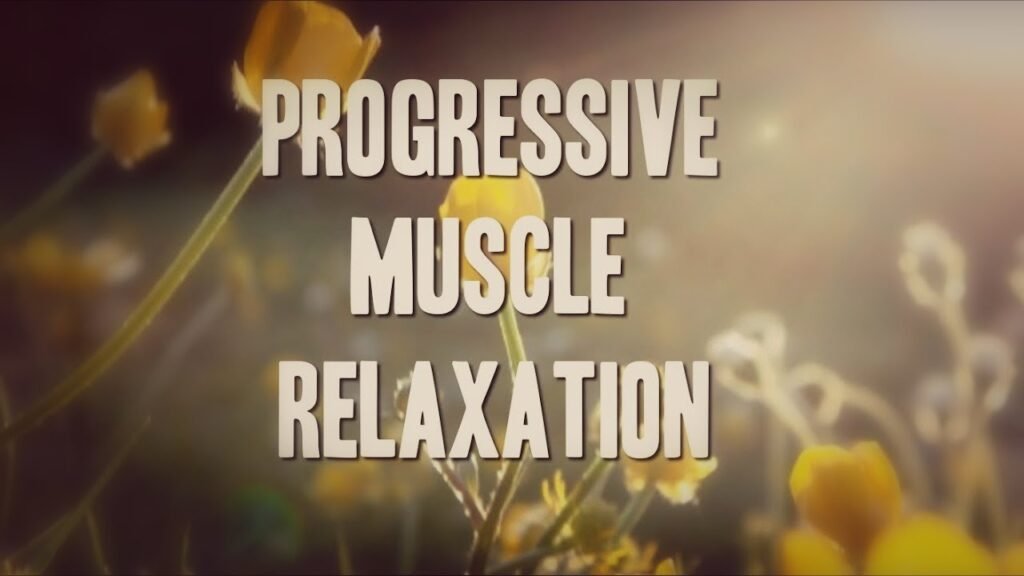
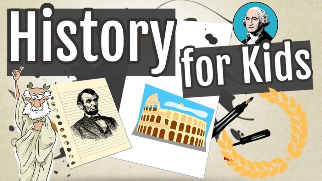
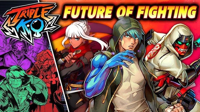
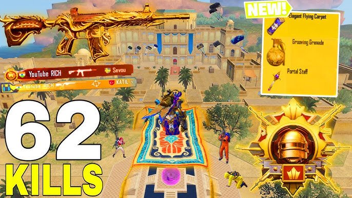
Attractive, Eye-Catching Thumbnail?
A great thumbnail isn’t just “pretty”—it’s a mix of psychology, marketing, and design. It captures attention, sparks curiosity, and communicates what the video is about within seconds. It uses color, composition, and emotion to trigger clicks—and most importantly, it delivers a promise that aligns with your video.
Why Thumbnails Are Crucial for YouTube Success
You can have the best video in the world—but if your thumbnail doesn’t get clicked, no one will ever see it. YouTube’s algorithm loves videos with high CTR, and thumbnails are the #1 factor in achieving that. A strong thumbnail means more views, more subscribers, and more growth.
How Much Do Graphic, Ideas & Skill Matter?
A LOT. Thumbnail design is not just dragging pictures into a box. It requires:
I use all these skills to deliver thumbnails that don’t just look good—they perform.
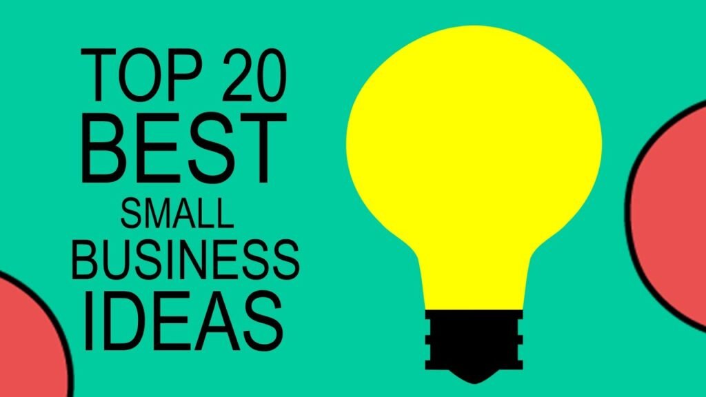
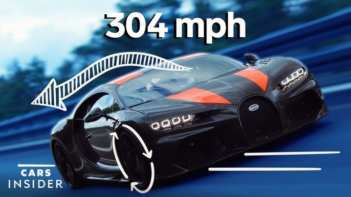
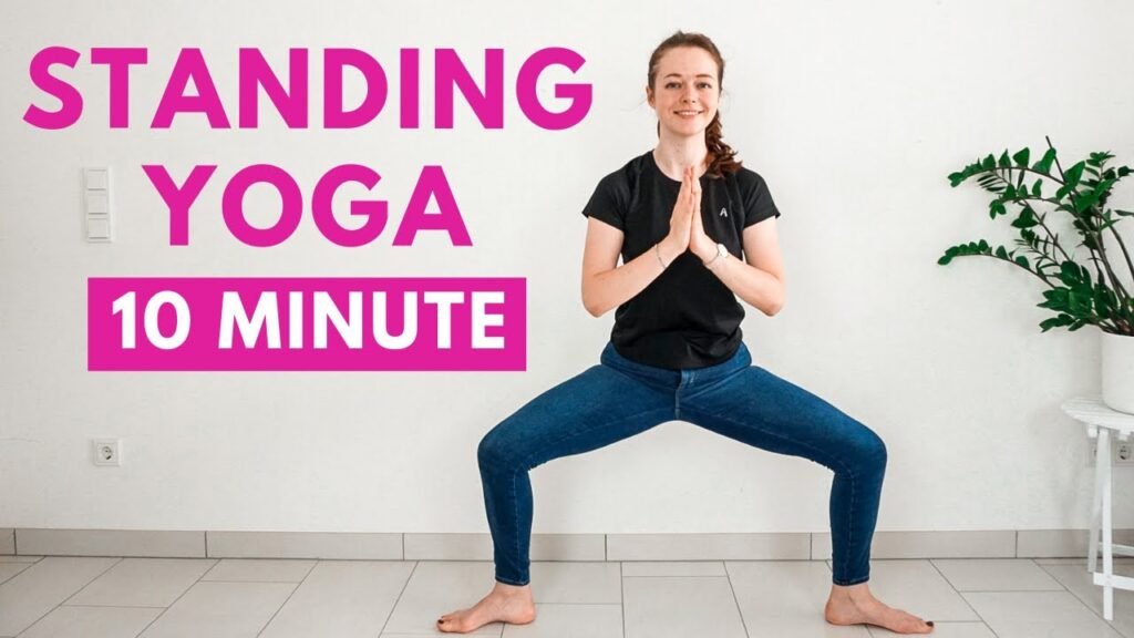
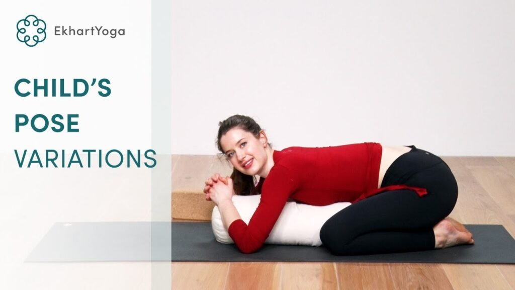
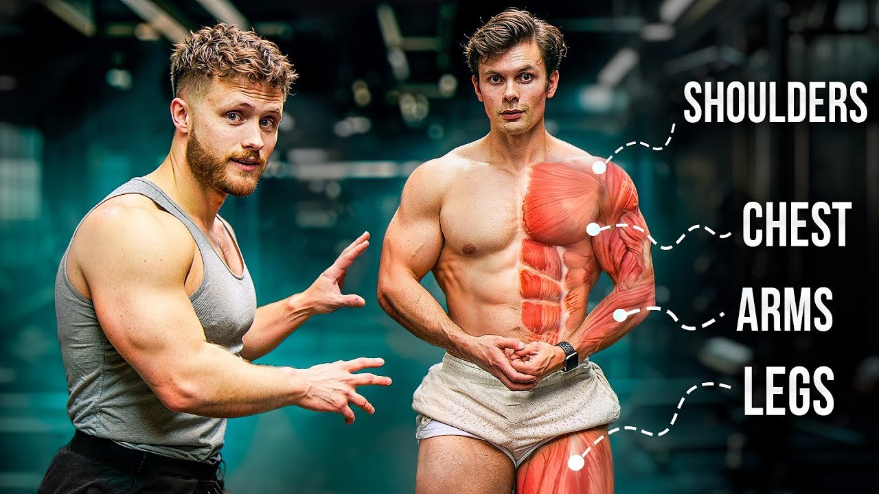
Key Elements of a Powerful YouTube Thumbnail (Explained):
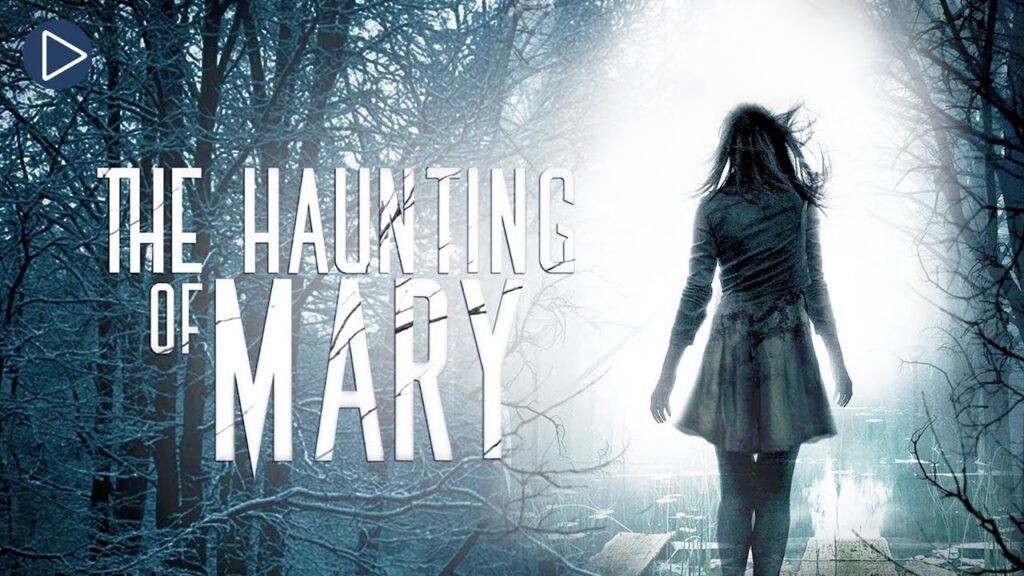
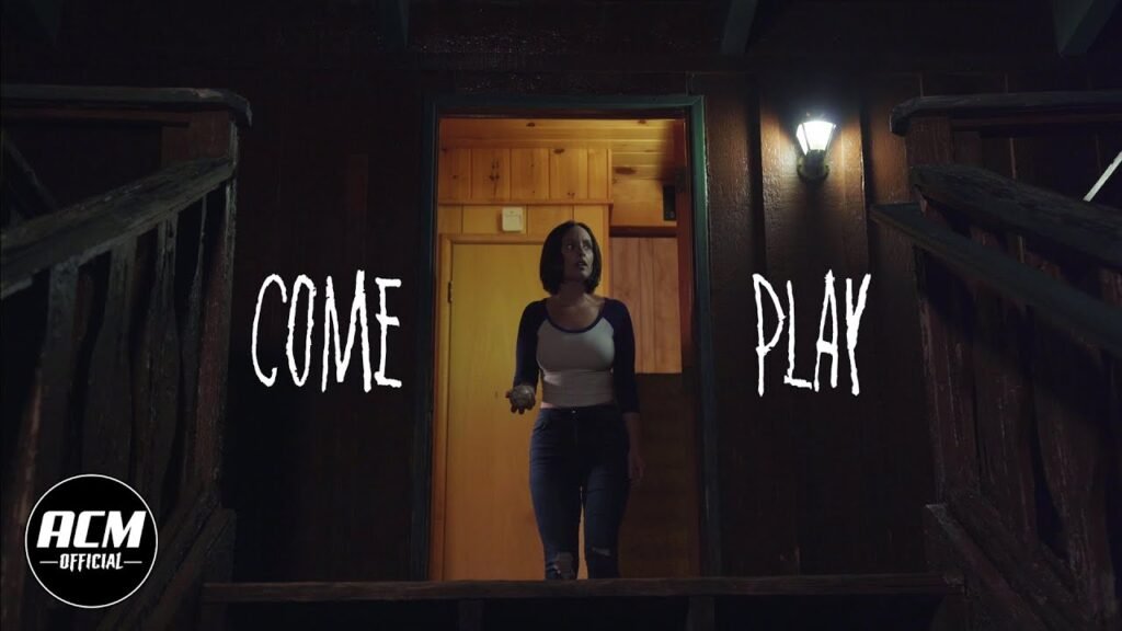
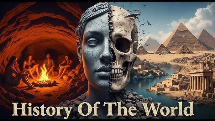
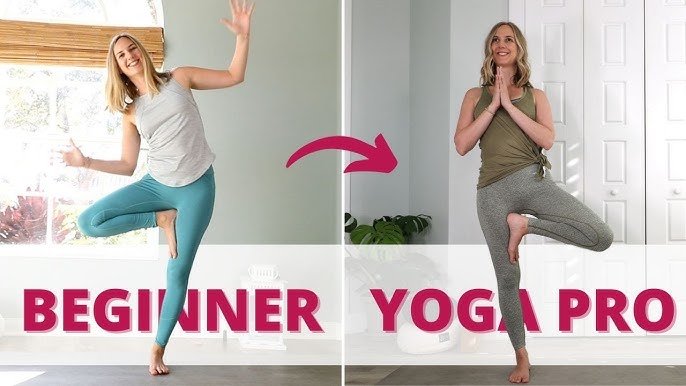
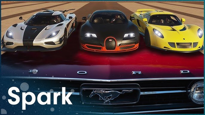
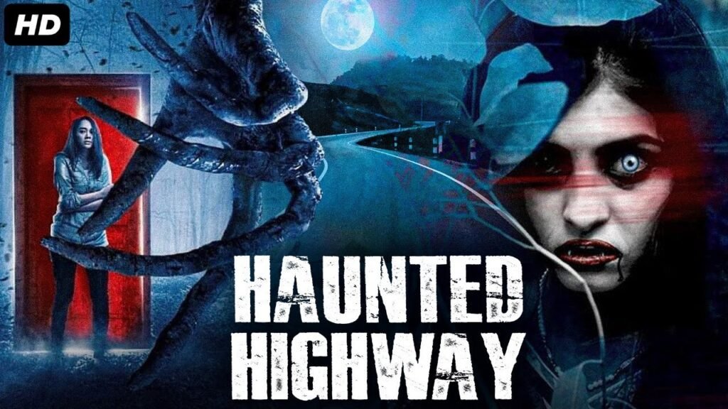
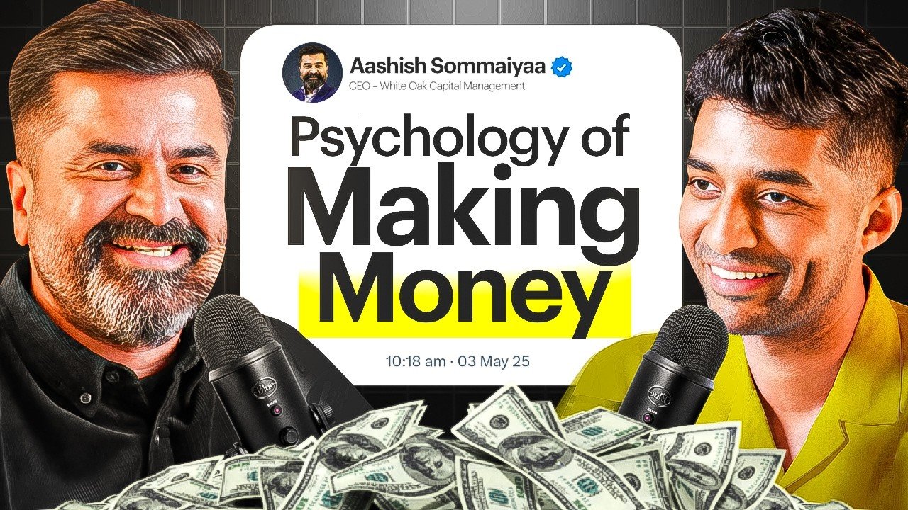
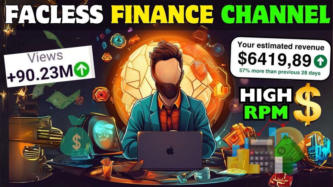
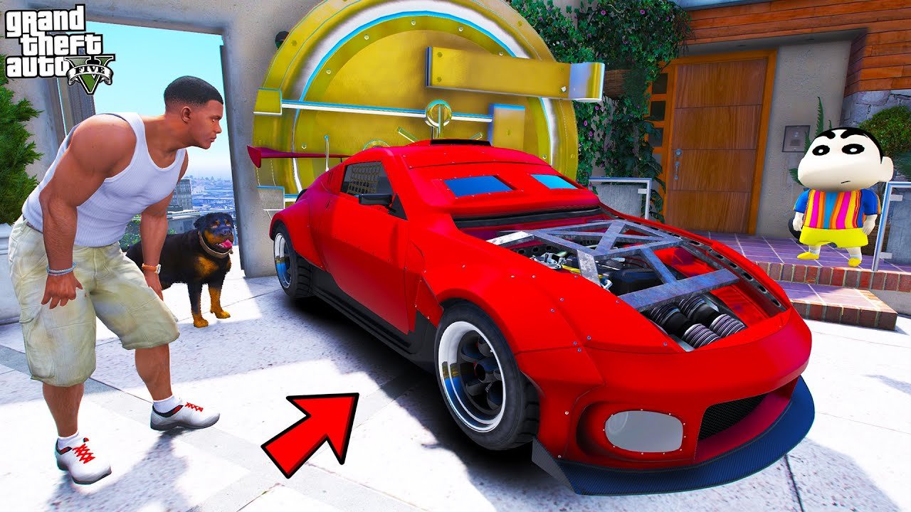
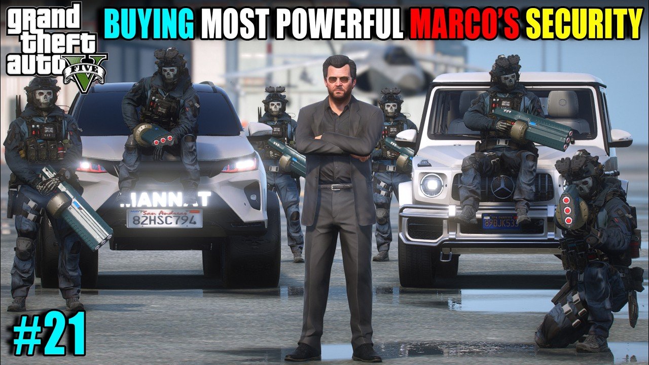
Bold Subject Focus:
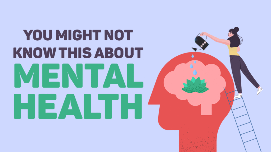
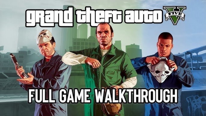
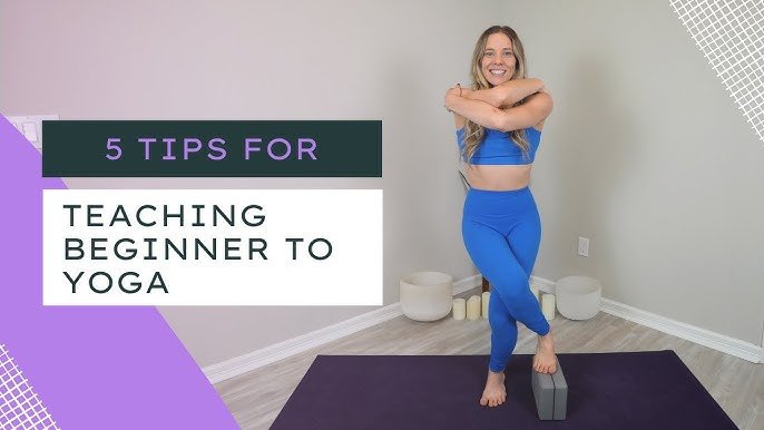
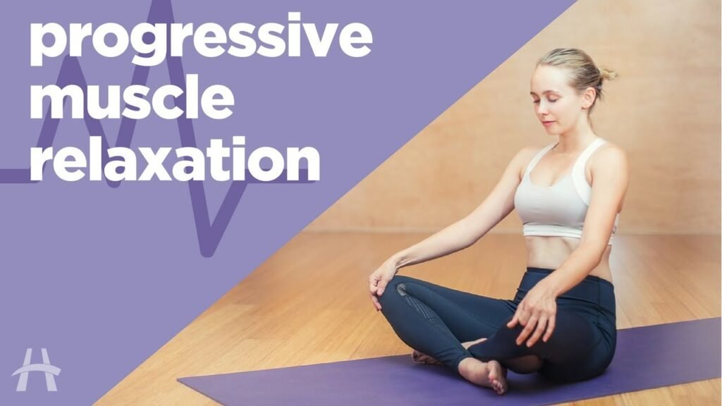
The main face or object should be clear, expressive, and easy to identify—even on small screens.
Strong Facial Emotions / Reactions:
Thumbnails with faces and strong emotions perform significantly better. I enhance expressions to connect instantly.
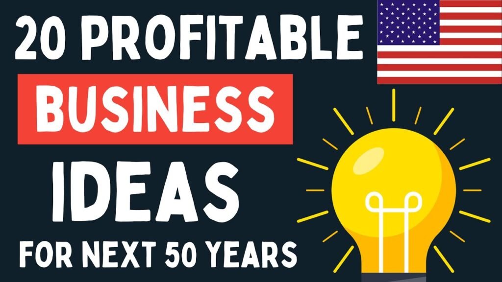
High Contrast Colors:
I use bright, contrasting colors that pop off the screen—without looking overdone.
Readable Text (Few Words):
2–4 words in bold, large fonts that support your title. I ensure the text is readable even on mobile.
Clean Background & Blur:
I separate subject from background using blur or depth effects so the focus remains strong.
Strategic Framing & Cropping:
I zoom into faces, use the rule of thirds, and position elements for maximum impact.
Branding Consistency:
Colors, fonts, or logo elements to make your thumbnails recognizable across your channel.
Psychological Triggers:
I use curiosity, surprise, drama, or mystery—whatever suits your niche—to provoke clicks.
Mobile Optimization:
I always check how thumbnails appear on mobile (70%+ viewers), ensuring nothing gets lost.
A/B Testing Ready:
I can create 2-3 variations so you can test which performs best, maximizing engagement.
Why Clients Choose Babulnoor for Thumbnails
Because I don’t just design, I think like a viewer. I blend design aesthetics with performance strategy, backed by real experience and proven results. Whether you run a vlog, tech channel, finance series, or reaction videos—your thumbnail will look professional, powerful, and scroll-stopping.